Users browsing tools often needed to:
-
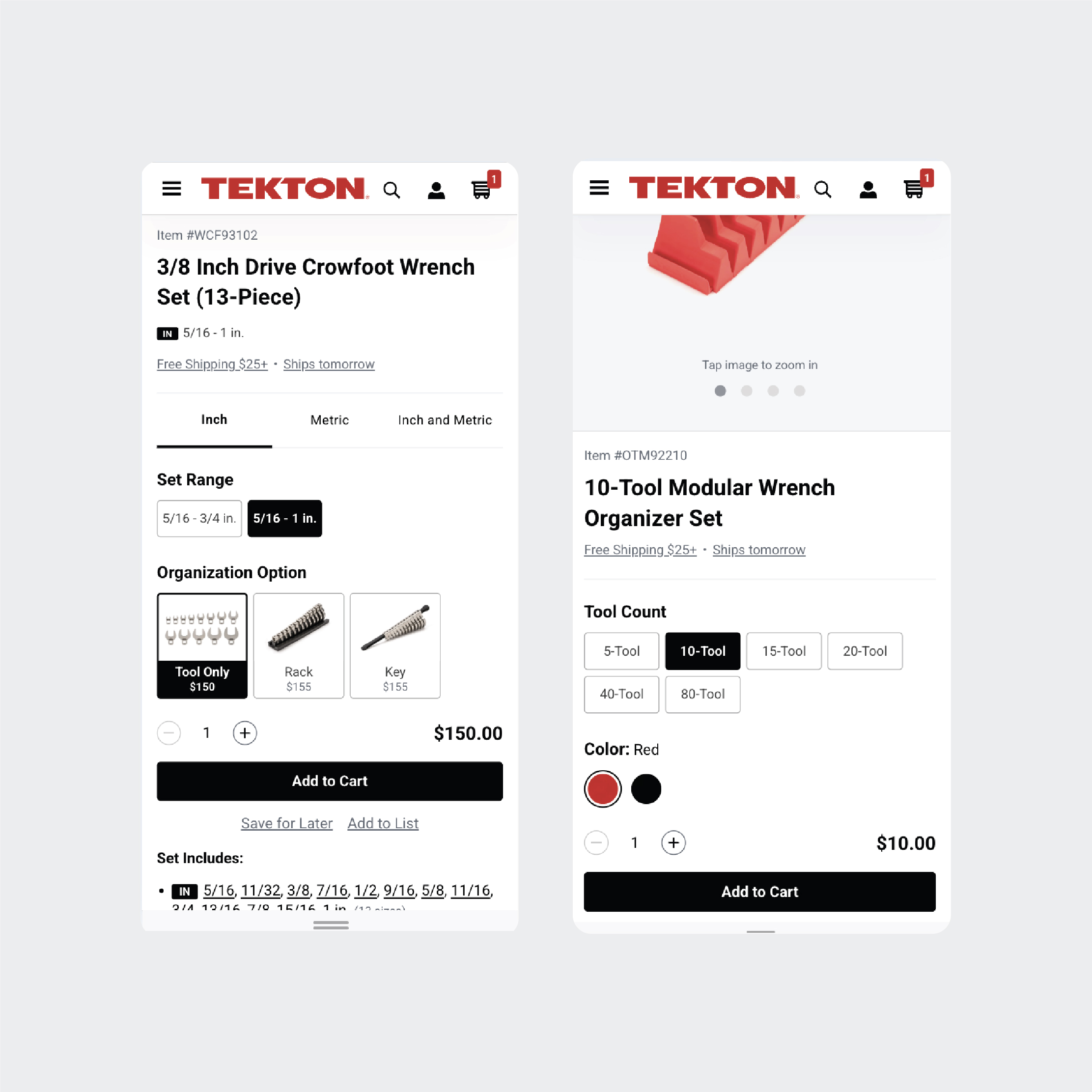
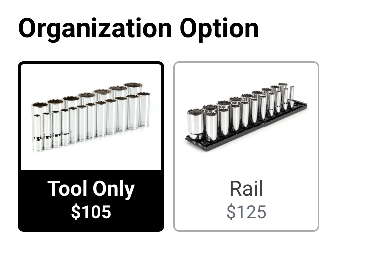
Open multiple product pages to understand organization options
-
Wait for slow cart flows
-
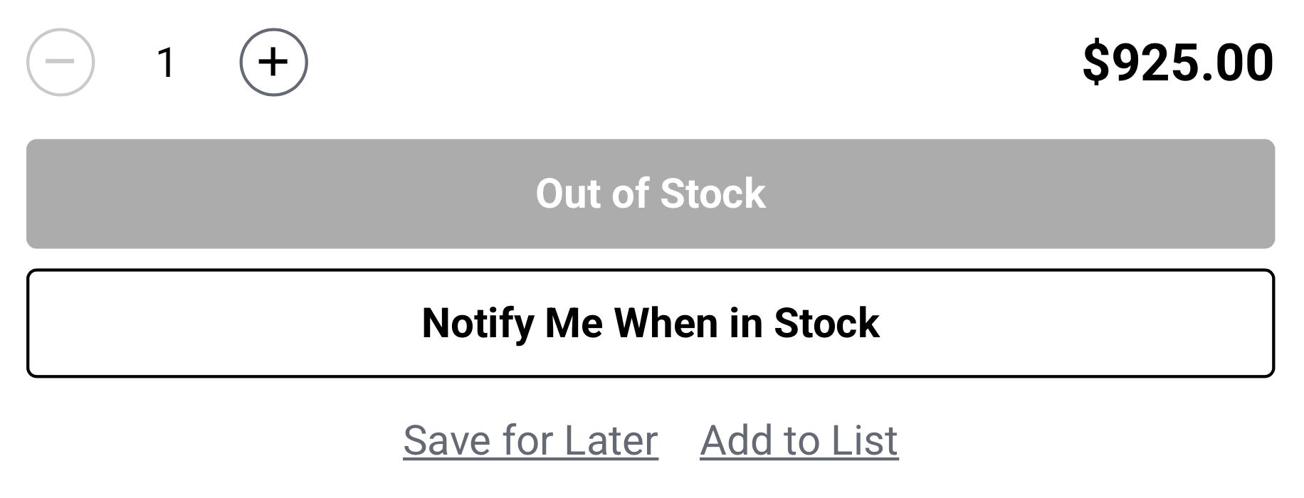
Encounter dead ends when products were out of stock
-
Lose momentum during purchase
Users browsing tools often needed to:
Open multiple product pages to understand organization options
Wait for slow cart flows
Encounter dead ends when products were out of stock
Lose momentum during purchase
Common behaviors observed:
Users browse multiple tools rapidly
Many compare organization configurations
Tool buyers want speed and clarity
Too many page loads
Lack of visual context
Frustration when items were unavailable
Users want to stay in the browsing flow and make fast purchase decisions without leaving the page.
The experience needed to be:
Fast
Snappy interactions
Minimal page loads
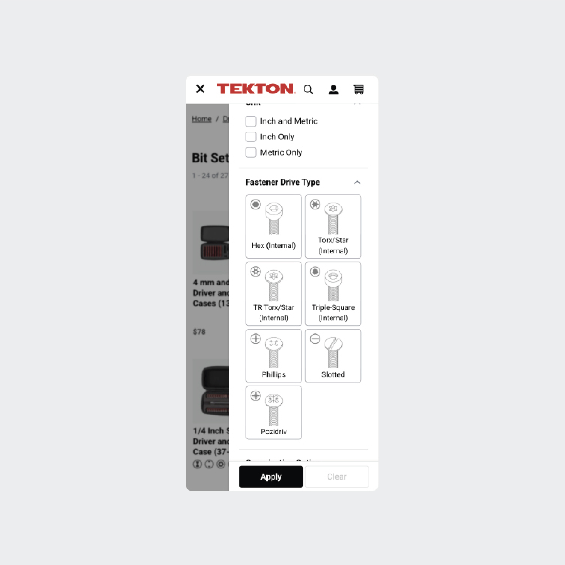
Informative
Show organization options visually
Helpful
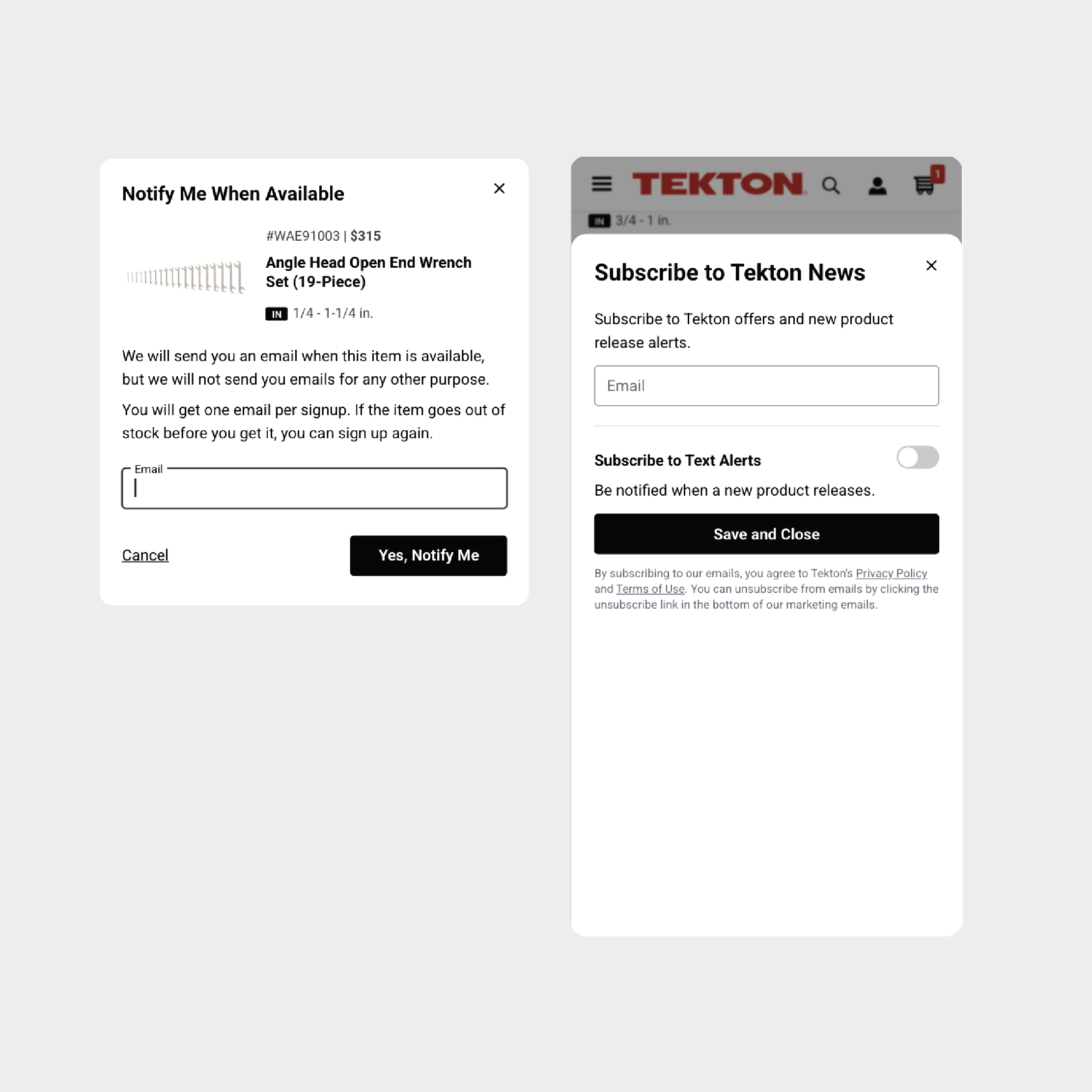
Provide a next step when products are unavailable
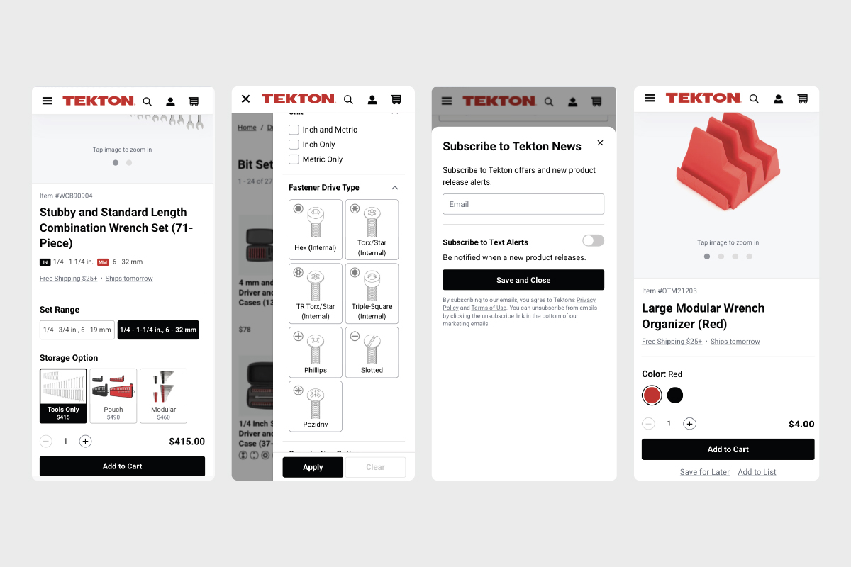
Consistent
Built with reusable design system patterns and components
This process could take several page loads per product.
If out of stock:
Key interaction principles:
Snappy feedback
Instant add-to-cart confirmation
Minimal disruption
No page refresh, toasts, or overlays
Clear system status
Loading states
Confirmation states
Progressive disclosure
Show more product information only when needed