Project Vision & Goal: Build an all-in-one website and mobile app featuring recipes, meal planning, recipe walk-throughs, and shopping list creation.
Tools Used: Adobe XD, Figma, Adobe Illustrator, Adobe Photoshop
Stakeholders: End Users (Special consideration to those with limited motor skills)
Role: Lead, UX Designer — Visual Design, Research, Prototype Design
Duration: 2 Months
Kickoff
Challenge: In the design process, we looked at a goal-directed design approached and answered some questions.
- Who were our competitors?
- Who is our primary audience?
- Which users are most important?
Target Audience
User Research and Journey Map
Goal Statement: Provide a quick and easy meal planning app to schedule, walk through cooking the recipe, and send the ingredients for shopping.
Persona Research
Meet the Users
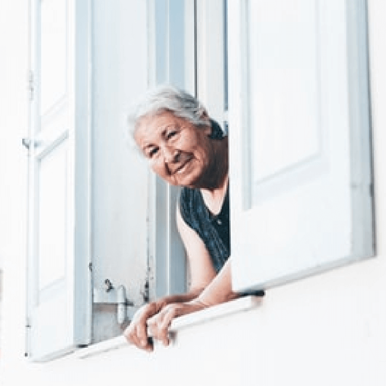
“I want to be the grandma who always has baked goods”
Elaine
- Age: 29
- Education: High School Diploma
- Hometown: Middleville, Michigan
- Family: Single
- Occupation Homemaker
Goals
- Live in independence
- Invest in family
- Still be able to live without limitations
Frustrations
- Arthritic hands that have trouble working
- Declining health
- Hard to navigate technology
Elaine is struggling with the limitations that comes with getting older but still wants to navigate life in independence. She always loved being a the Grandma that always has a baked goods and is looking for ways to maintain this even throughout declining health.
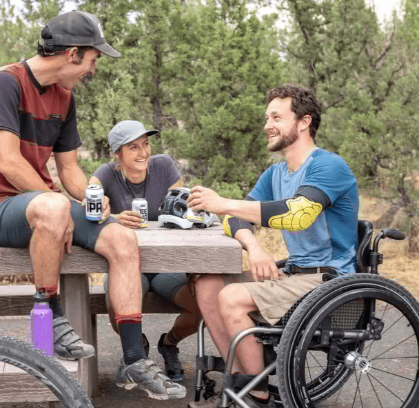
”I want to be independent”
Ramon
- Age: 35
- Education: Bachelors
- Hometown: Pittsburg, Pennsylvania
- Family: Single
- Occupation: Insurance Salesman
Goals
- Make homemade meals
- Eat healthy
- Live simply
Frustrations
- Complicated subscriptions
- Hard to use technology
- Difficulty planning
Ramon is looking for an easy technology solution to help plan and make homemade meals. He is motivated by independence and a desire to live simply.
Wireframe Development
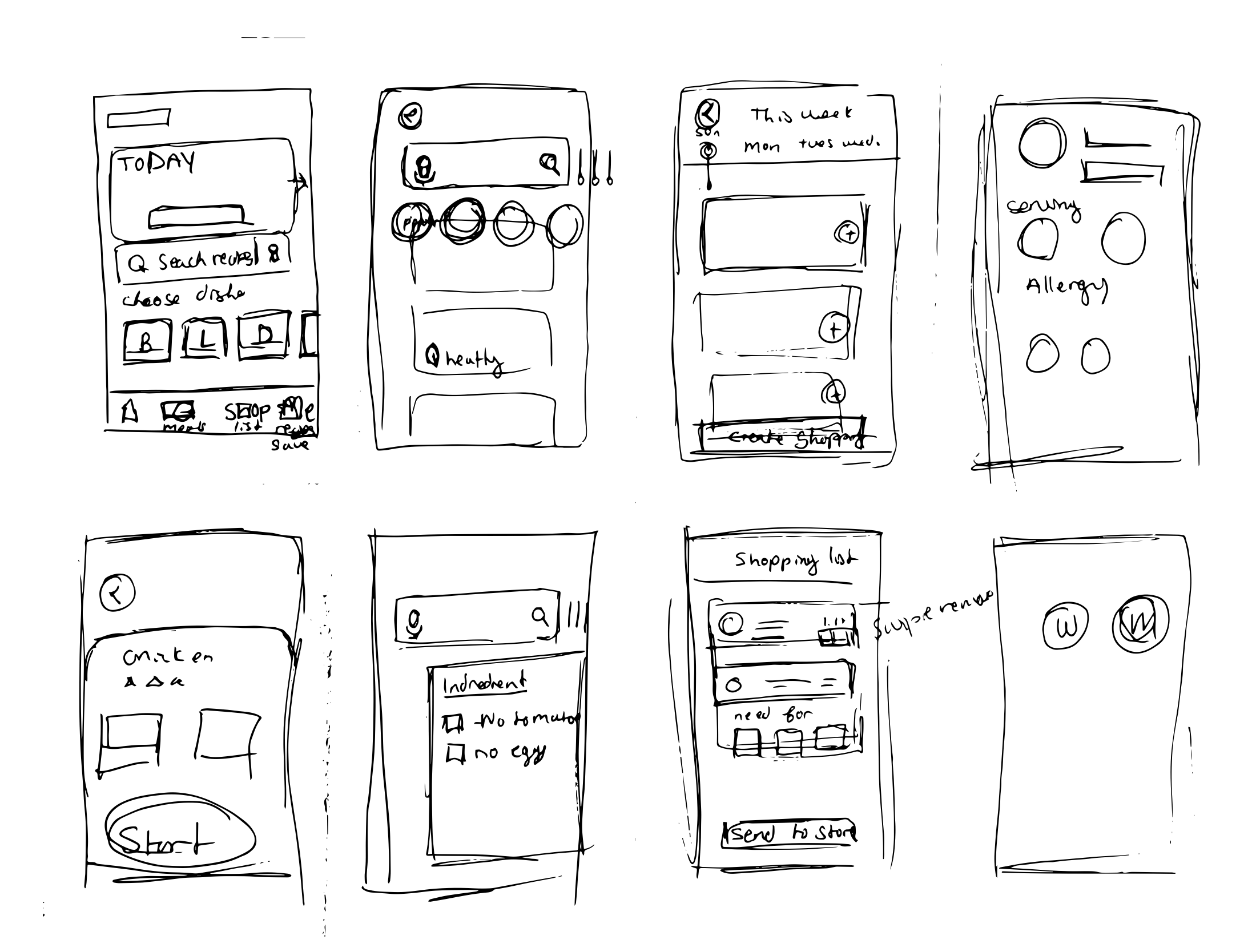
And Lo-Fi Prototyping: Large buttons and multistep directions were built
Mockups
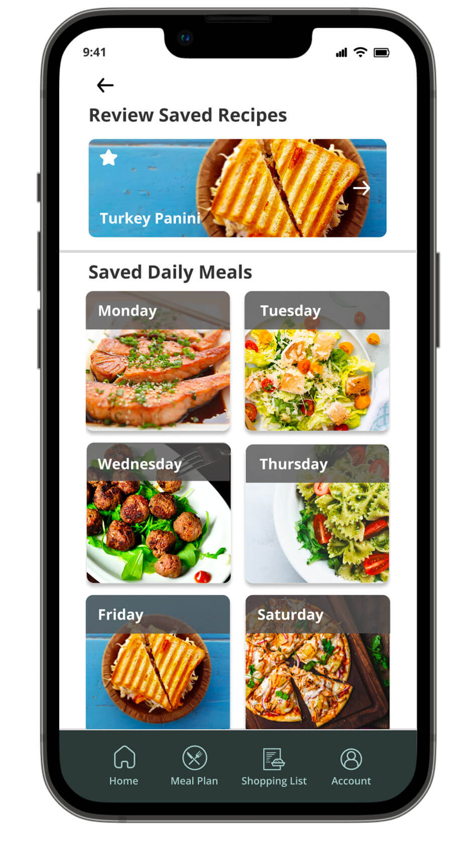
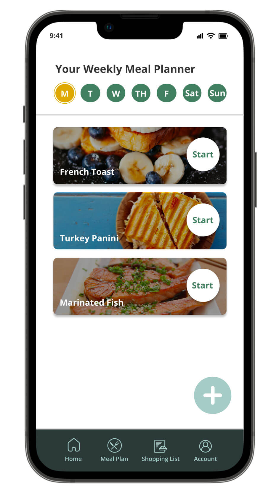
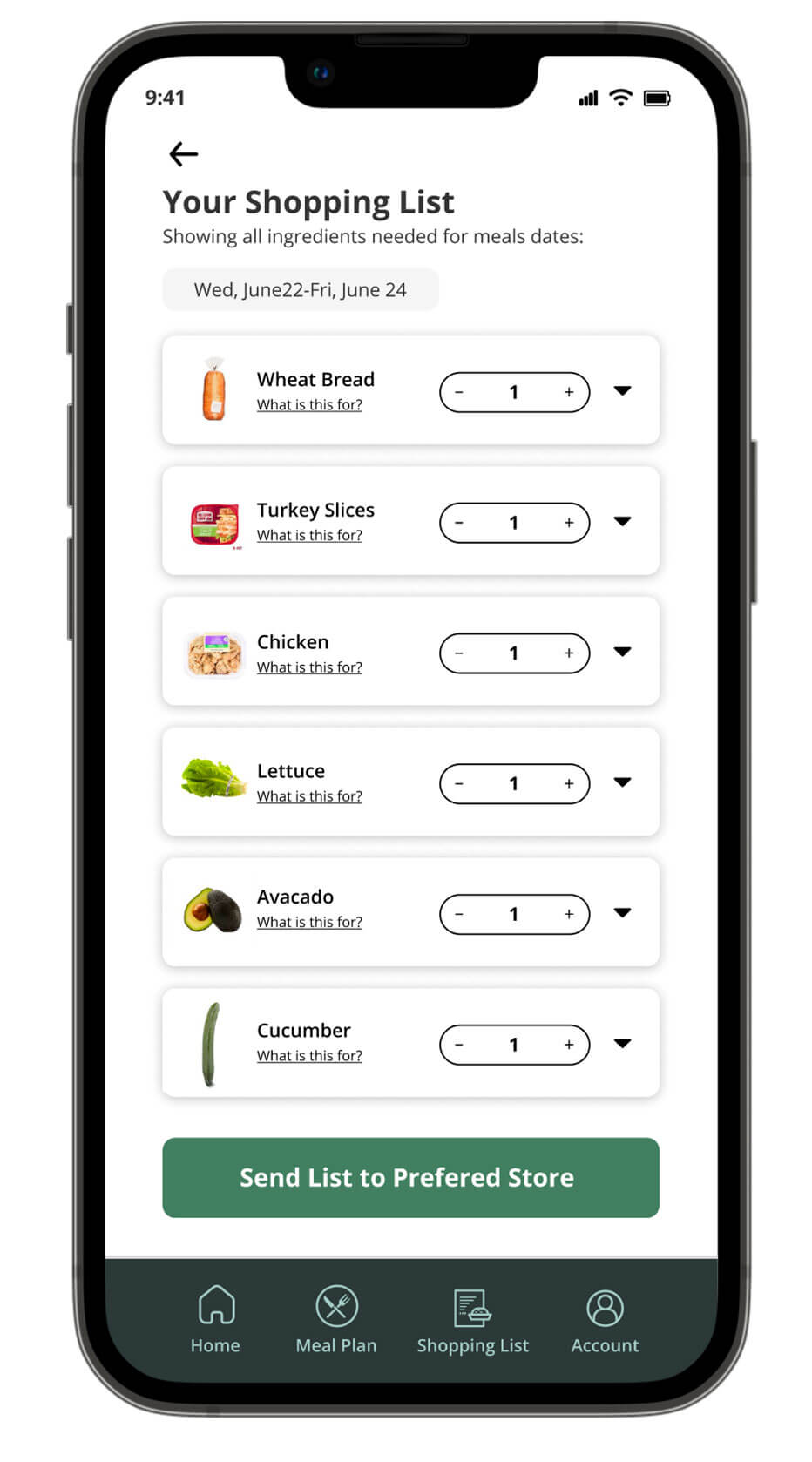
These mockups showcased the menu pages, adding recipes for the weekly menus and the automatic lists ready to be sent to the store.
Style Guide
Using an vibrant and garden-inspired color pallet, this branding was built for a fun and engaging experience.


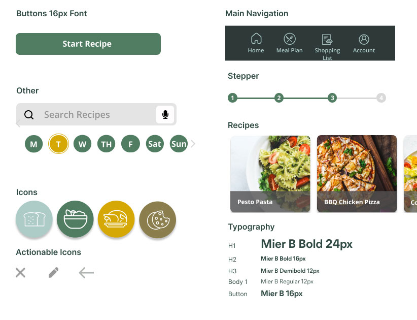
Accessibility Considerations
Consideration for Limited Motor Skills
Voice prompt options available for navigation
Color pallet and button contrast
Large color contrast for easy reading with icon navigation.
Multi-step Instructions
Breakup of recipe details for enlarged text, buttons, and easier reading.
Usability Testing
Research Questions
How long does it take for a user to complete a recipe?
How long does it take or organize recipes?
How does a user navigate the shopping list export
Participants
5 participants
3 female, 2 male. Ages 35-81
Methodology
10 minutes per participant
The United States, remote
Unmoderated usability test
Users were asked to perform tasks in a low-fidelity prototype
Key Performance Indicators (KPIs)
Time to order through the app
Conversion rate
System Usability Scale
Users were asked to perform tasks in a low-fidelity prototype
Themes, Insights, and Recommendations
Before and After Testing
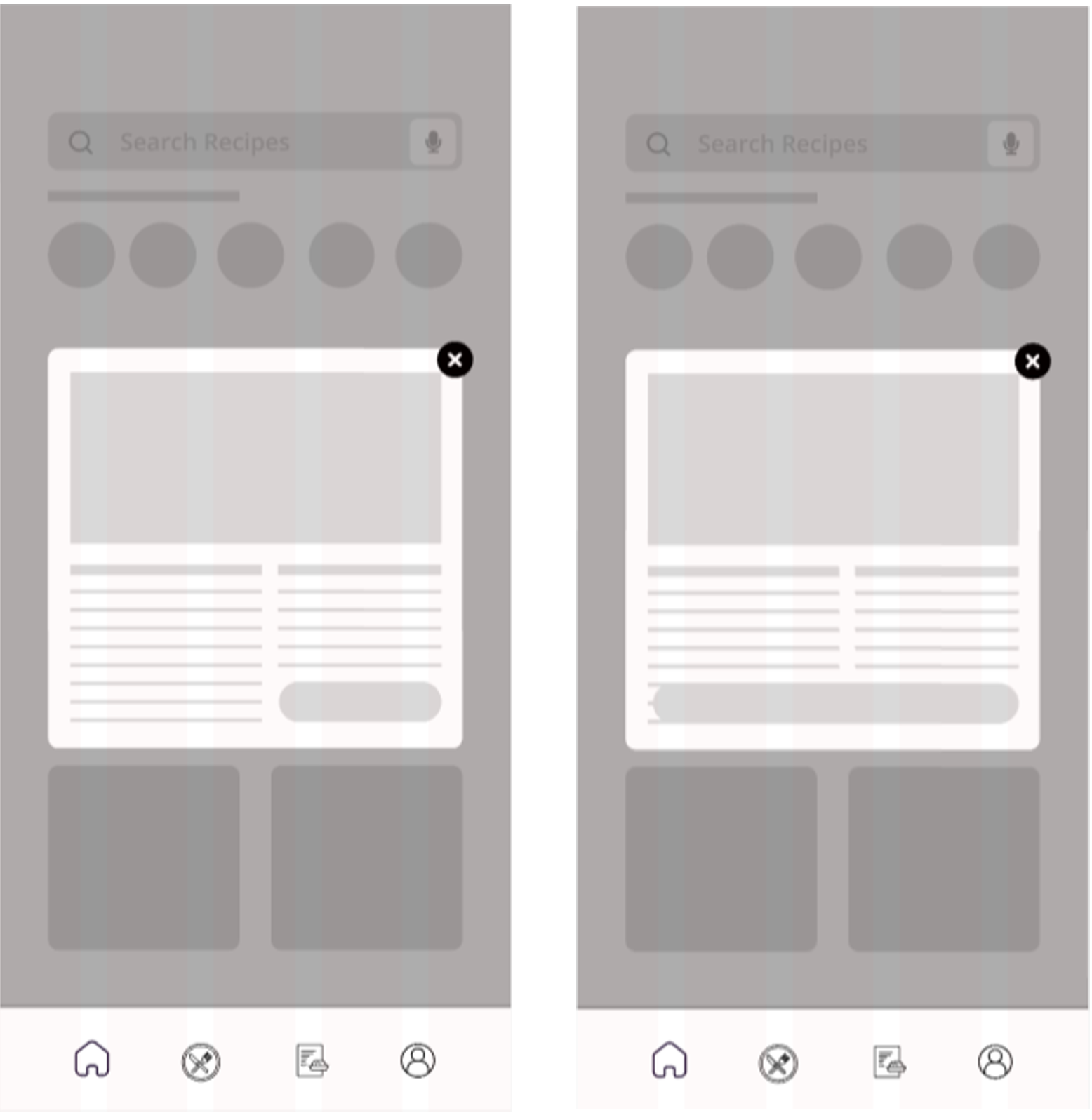
“Some buttons are hard to click” – User
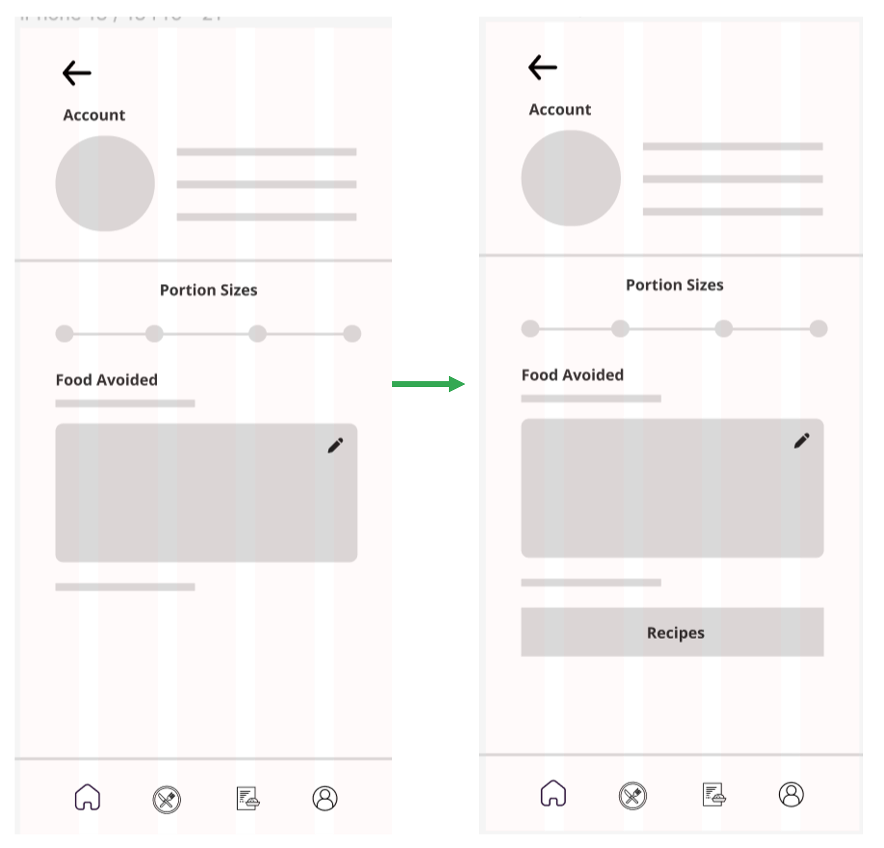
“It would be nice to see my recipes in the account page” – User
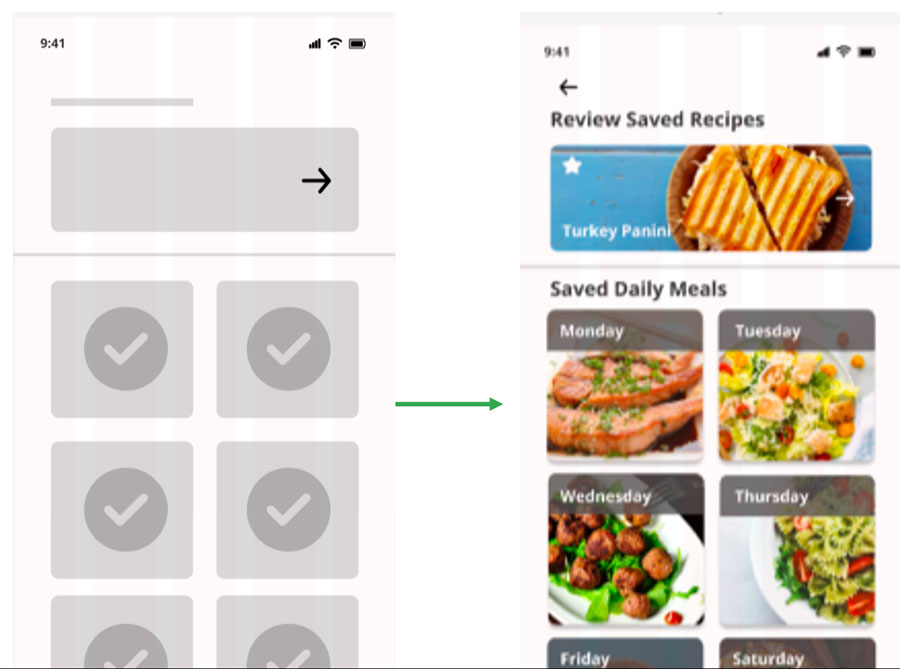
“Am I supposed to drag these items?” – User
Prototype
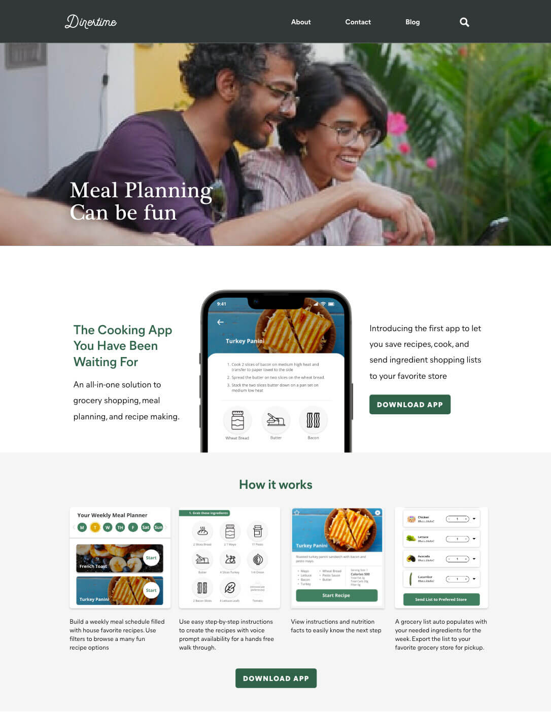

Other Assets
In addition to finalizing the app, a website design was needed. View a high fi website prototype built in Adobe XD.
Takeaways
I look forward to seeing how this app will impact independence and invest in time around the dinner table with loved ones.
The next Steps include:
- Further development and launch to target market
- Release to sample audience and test
- Larger release after evaluation
If you have any questions or would like a more detailed outline, contact me!
